


Simon Peng Real Estate
Building A Solid Brand For A Seasoned Broker

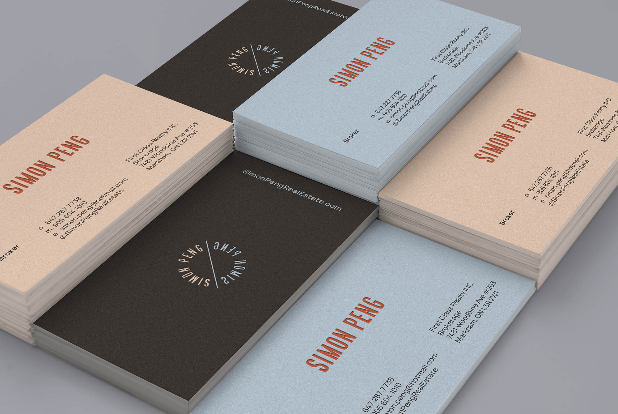
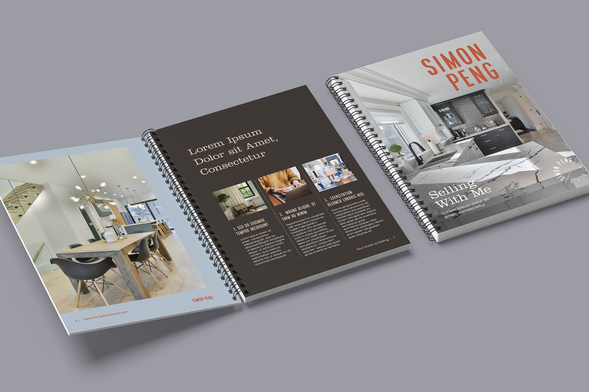
For Simon Peng we created branding inspired by painter Giorgio Morandi’s colour palette, balanced with a bold and clean logo design for a reassuring yet confident feel that speaks to Simon’s industry authority as a 10-year Toronto real estate veteran. With this reference we built an intuitive website for Simon that provides a simplified user experience and immediately communicates his value and expertise to both his local and international clients.


Primary Logo

Secondary Logo
Brandmark